Visualization of air quality in Buffalo and the effective factors
Xiaohan Rui
Introduction
Each people are concerned about air quality because we need to breathe all the time. And with the air quality index data, we can know how clean or polluted our outdoor or indoor air is, along with associated health effects that may be of concern. And these AQI data uses different colors to present levels which tell people when to take action to protect their health.
In this project, calendar heatmap will be a useful method to present daily PM2.5 AQI values. The heat map often interacts with the cluster graph to make an intuitive comparative analysis of the characteristics of different elements in different samples. Also in heatmaps, a single element in a matrix can be represented by different colors, and then different units can be compared and analyzed.
Additionally, it is not enough to just know what is air quality. So learning the possible infuencing factors is also important and useful. I want to use daily temperature data and average daily wind speed data from the Global historical climatology network data we used in Geo503 chapter 8 class. With the calendar heatmap, we can add in those possible influential data to find if direct relationships exsist. Also some statistics should be done to proof the relationships, such as Pearson correlations. If the results show that low AQI days may be effected by low wind speed and high daily temperature, it would be a powerful reminder to let people make preventive measures in such weather, such as wearing a mask.
Materials and methods
Data
AQI data is downloaded from EPA AIR data website: https://www.epa.gov/outdoor-air-quality-data. The AirData website gives you access to air quality data collected at outdoor monitors across the United States, Puerto Rico, and the U.S. Virgin Islands. The data comes primarily from the AQS (Air Quality System) database. In this project, we choose PM2.5 AQI data in 2016 from this website. When logging in this website, we can click “Download Daily Data” and then choose “PM2.5”, “2016”, “New York” and “Buffalo” as key words to get specific data for this project.
Global historical climatology network (GHCN) is an integrated database of climate summaries from land surface stations across the globe that have been subjected to a common suite of quality assurance reviews.
In this project we use three variables from GHCN data:
AWND: Average daily wind speed (meters per second or miles per hour as per user preference);
TMAX: Daily maximum temperature;
TMIN: Daily minimum temperature.
Method and Code
Load any required packages in a code chunk (you may need to install some packages):
library(plyr)
library(dplyr)
library(ggplot2)
library(openair)
library(ggplot2)
library(readxl)
library(rnoaa)
library(ggmap)
library(openair)
library(climdex.pcic)
library(DT)
library(dygraphs)
library(zoo)
library(xts)
library(htmlwidgets)
library(widgetframe)
Load AQI data:
Load the PM2.5 air quality data in Buffalo in 2016: This data comes from EPA Air data that is mentioned in Data above. Some functions in the packages can only recognize “date” as the column name so we first need to change the name.
mytable=read_excel("Data/Buffalo_PM2.5_AQI.xlsx")
names(mytable)[1]<-"date"
According to the method mentioned in reference[1], I need to set some parameters to extract daily and monthly factors to make the heatmap plots below more easier and understandable to be shown:
dat=mytable
dat$month<-as.numeric(as.POSIXlt(dat$date)$mon+1)
dat$monthf<-factor(dat$month,levels=as.character(1:12),labels=c("Jan","Feb","Mar","Apr","May","Jun","Jul","Aug","Sep","Oct","Nov","Dec"),ordered=TRUE)
dat$weekday<-as.POSIXlt(dat$date)$wday
dat$weekdayf<-factor(dat$weekday,levels=rev(0:6),labels=rev(c("Sun","Mon","Tue","Wed","Thu","Fri","Sat")),ordered=TRUE)
dat$week <- as.numeric(format(dat$date,"%W"))
dat<-ddply(dat,.(monthf),transform,monthweek=1+week-min(week))
Load Weather data:
Weather data comes from Global historical climatology network (GHCN) and we use three variables as the influential factors, which are average daily wind speed (awnd), daliy maximum temperatures (tmax) and daily minimum temperatures (tmin).
datadir="data"
st = ghcnd_stations()
st=dplyr::filter(st,element%in%c("TMAX","TMIN","AWND"))
coords=as.matrix(geocode("Buffalo, NY"))
dplyr::filter(st,
              grepl("BUFFALO",name)&
              between(latitude,coords[2]-1,coords[2]+1) &
              between(longitude,coords[1]-1,coords[1]+1)&
         element=="TMAX")
## # A tibble: 0 x 11
## # ... with 11 variables: id <chr>, latitude <dbl>, longitude <dbl>,
## # elevation <dbl>, state <chr>, name <chr>, gsn_flag <chr>,
## # wmo_id <chr>, element <chr>, first_year <int>, last_year <int>d=meteo_tidy_ghcnd("USW00014733",
var = c("TMAX","TMIN","AWND"),
keep_flags=T)To make results accurate we need to convert correct units of temperatures that is converting it to degrees C.
d_filtered=d%>%
  mutate(tmax=ifelse(qflag_tmax!=" "|tmax==-9999,NA,tmax/10))%>%
  mutate(tmin=ifelse(qflag_tmin!=" "|tmin==-9999,NA,tmin/10))%>%
  mutate(awnd=ifelse(qflag_tmin!=" "|awnd==-9999,NA,awnd))%>%
  arrange(date)
Because we use AQI data in 2016, we need to filter wealth data in 2016. Also, the datatable function is a dynamic visualization method that can show selected data.
d_filtered_2016=filter(d_filtered,date>=as.Date("2016-01-01")&date<=as.Date("2016-12-31"))

datatable(d_filtered_2016, options = list(pageLength=5)) %>% frameWidget(height=400)
Results
Comparisons between two visualization methods
Calendar heatmap:
This can take a few seconds to show the plot about Calendar Heatmap of PM2.5 air quality in Buffalo. In this ggplot functions, I use different colours to show different AQI values in which yellow represents low value and red represents high value. Additionally, in Air Quality Index(AQI) leves, it is good day when AQI value is less than 50, and more than 50 but less than 100 means moderate, and more than 100 but less than 150 means unhealthy for sensitive groups. These information can all be shown in this calendar heapmap figure.
ggplot(dat,aes(monthweek, weekdayf,fill=DAILY_AQI_VALUE))+

  geom_tile(colour='white') +

  facet_wrap(~monthf ,nrow=3) +

  scale_fill_gradient(space="Lab",limits=c(0, max(dat$DAILY_AQI_VALUE)),low="yellow", high=" red") +

  labs(title="Buffalo PM2.5 AQI Calendar Heatmap in 2016",x="Week of month",y="")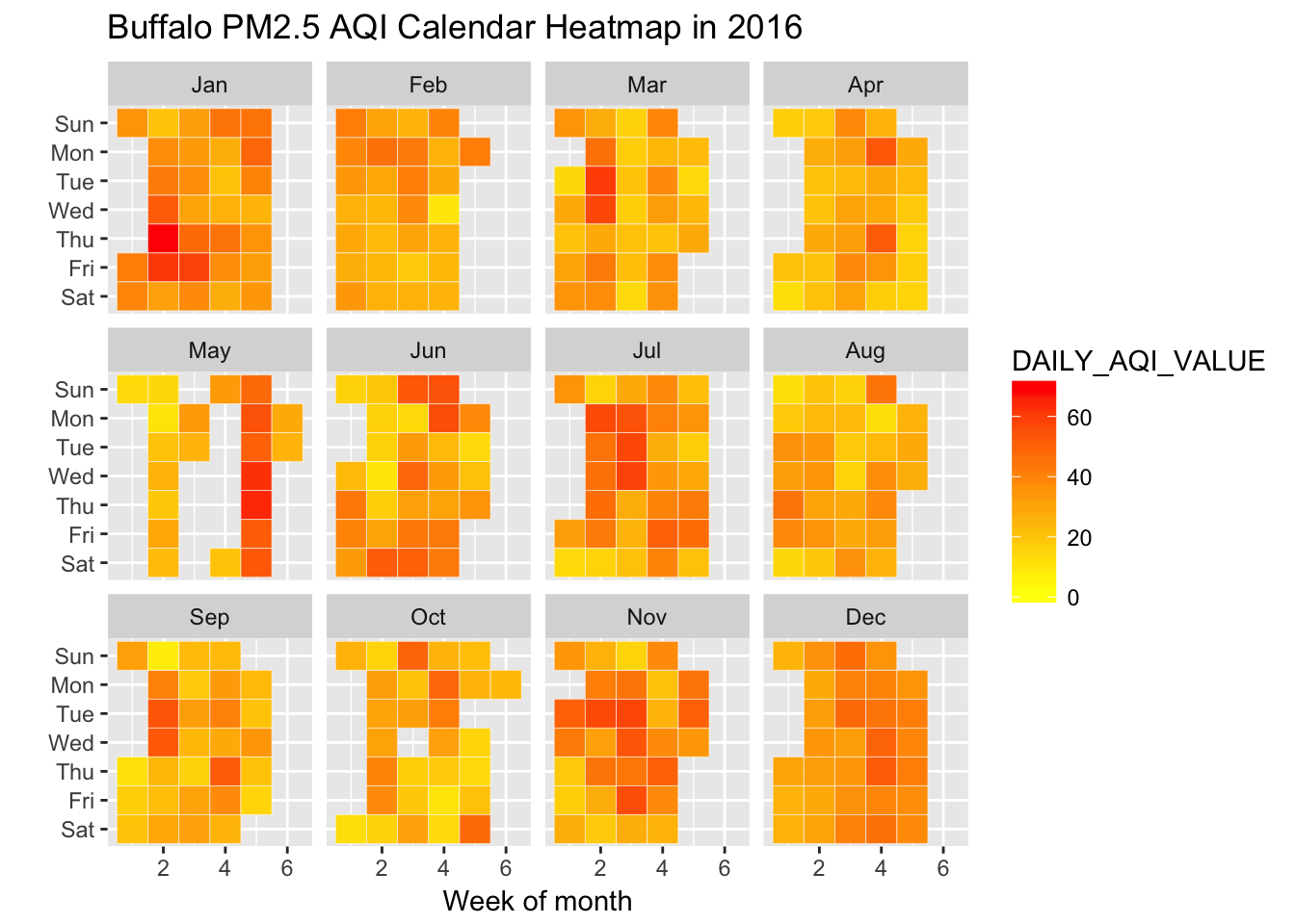
Dygraphics:
Dygraph function provides rich facilities for charting time-series data in R. I use the same AQI data in 2016 in Buffalo by dygraph to compare results with calendat heatmaps.
dt=xts(dat$DAILY_AQI_VALUE,order.by=dat$date)

dygraph(dt, main = "Daily AQI value in Buffalo, NY") %>%
  dyRangeSelector(dateWindow = c("2016-01-01", "2016-12-31"))%>%
  frameWidget(height =300)
Through the two graphics above, it is clearly to find that calendar heatmap is better for readers to get more inofrmation, such as how many unhealthy days in 2016? or which days are unhealthy days? In dygraphics people can see the trend of the changing about AQI values but it does not provide with daily data visually.
AQI values and the influential factors
In this project, we choose three effective factors which are average daily wind speed, daily maximum temperatures and daily minimum temperatures. So calendarplot function is used to show different levels of each factors in each day so that we can see changes in every day.
Awnd
Plots the average daily wind speed:
calendarPlot(d_filtered_2016, pollutant = "awnd", year=2016, main = "Average daily wind speed in Buffalo (2016)", cols = "heat")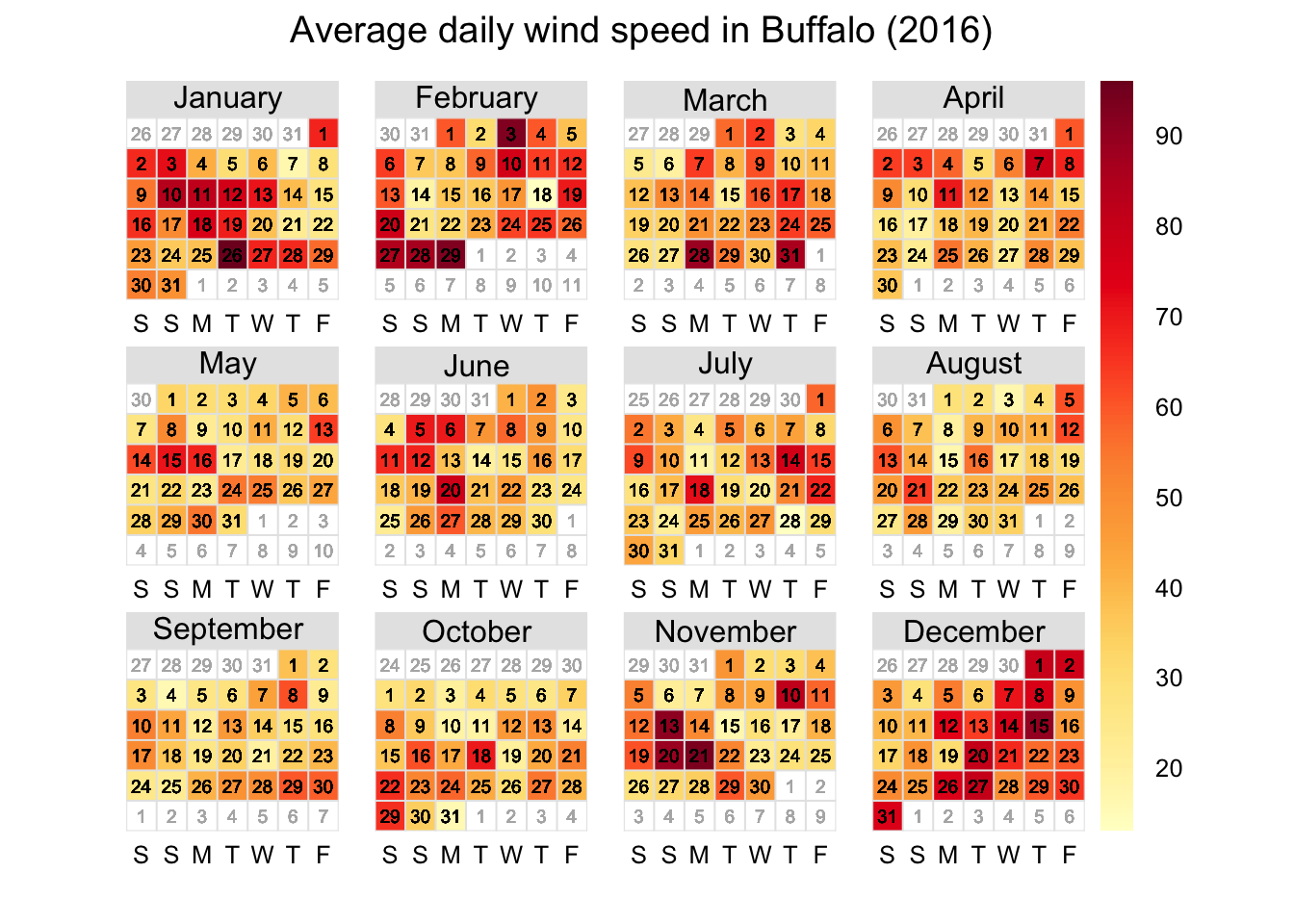
Tmax
Plots the daily maximum temperatures:
calendarPlot(d_filtered_2016, pollutant = "tmax", year=2016, main = "Daily maximum temperatures in Buffalo (2016)")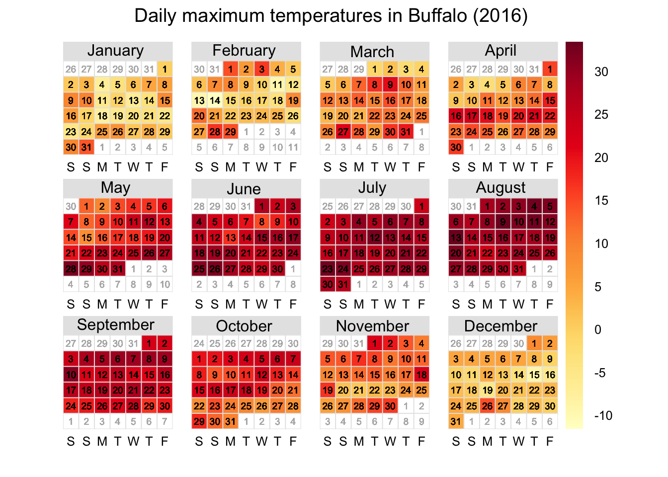
Tmin
Plots the daily minimum temperatures:
calendarPlot(d_filtered_2016, pollutant = "tmin", year=2016, main = "Daily minimum temperatures in Buffalo (2016)")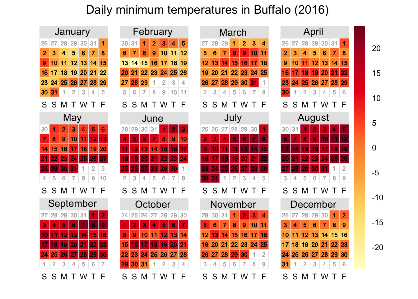
Correlation Analysis
According to figures above, we can reach the preliminary conclusion that high temperature may be correlative with unhealthy air quality. However, this hypothsis need to be proved so we do Pearson Correlations for each effective factors:
newdat= d_filtered_2016 %>% select(id, date, awnd, tmax,tmin)
newair=mytable %>% select(date, DAILY_AQI_VALUE)
newair$date=as.Date(as.POSIXct(newair$date))
unitdat=full_join(newdat, newair, by="date")
unitdat$awnd=as.numeric(as.character(unitdat$awnd))
cor.test(unitdat$awnd,unitdat$DAILY_AQI_VALUE,method="pearson")
##
## Pearson's product-moment correlation
##
## data: unitdat$awnd and unitdat$DAILY_AQI_VALUE
## t = -1.2634, df = 352, p-value = 0.2073
## alternative hypothesis: true correlation is not equal to 0
## 95 percent confidence interval:
## -0.17022796 0.03731154
## sample estimates:
## cor
## -0.06718491cor.test(unitdat$tmax,unitdat$DAILY_AQI_VALUE,method="pearson")##
## Pearson's product-moment correlation
##
## data: unitdat$tmax and unitdat$DAILY_AQI_VALUE
## t = 1.9963, df = 352, p-value = 0.04667
## alternative hypothesis: true correlation is not equal to 0
## 95 percent confidence interval:
## 0.001590829 0.207752301
## sample estimates:
## cor
## 0.1058084cor.test(unitdat$tmin,unitdat$DAILY_AQI_VALUE,method="pearson")##
## Pearson's product-moment correlation
##
## data: unitdat$tmin and unitdat$DAILY_AQI_VALUE
## t = 0.47788, df = 352, p-value = 0.633
## alternative hypothesis: true correlation is not equal to 0
## 95 percent confidence interval:
## -0.07898188 0.12935473
## sample estimates:
## cor
## 0.0254629In Pearson correlation method, the results mean there are high correlations between x and y when p-value is less than 0.05 and the absolute value of sample estimates(r value) is higher. Based on this theory, the three results above show that high temperatures have correlation with daily AQI values. So finally we can get the conclusion that the air quality is worse when temperature rises.
Conclusions
Based on the results, we finlly get those conclusions: 1) Calendar heatmap is better than other analysis graphics in some daily applications. It is more clearly and friendly to find specfic days and to do statistics about number of days. 2) Due to results of Pearson correlation, comparing to wind speed and low temperature, high temperature is considered as the factor that has correlation with daily AQI values in this project. According to this result, when high temperature comes, there may be more unhealthy-air-quality days than other times. Based on this conclusion, people can do some useful and helpful solutions such as wearing a mask in high-temperature days to prevent air pollution.
Additionally, the data used in this project is limited so that there are errors exsisting obviously. I think one-year data is not enough and air quality problem is very complex so there may be other effective factors. Futher study should be done to prove the correlations.
References
[1] http://margintale.blogspot.com/2012/04/ggplot2-time-series-heatmaps.html
[2] http://www.r-graph-gallery.com/284-calendar-heatmap/
[3] https://rpubs.com/haj3/calheatmap
[4] https://www.epa.gov/outdoor-air-quality-data
[5] Global historical climatology network data (GHCND)